Task #38701
Make Install Tool section "All Configuration" more user friendly
| Status: | Resolved | Start date: | 2012-07-06 | |
|---|---|---|---|---|
| Priority: | Should have | Due date: | ||
| Assigned To: | Ernesto Baschny | % Done: | 100% |
|
| Category: | Install Tool | Spent time: | - | |
| Target version: | 6.2.0 | |||
| TYPO3 Version: | 6.0 | Complexity: | ||
| PHP Version: | Sprint Focus: |
Description
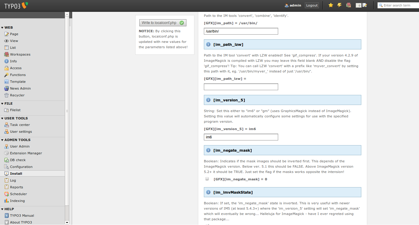
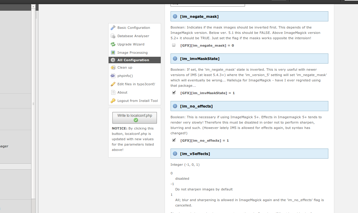
When editing something in the Install Tool section "All Configuration" you have to scroll down to the very bottom to apply your changes (or press enter).
This change positions the submit fieldset / button fixed on the right side, so that it is visible all the time and changes can be applied without extensive scrolling.
Related issues
Associated revisions
[FEATURE][UX] Install Tool usability and visual enhancements
- Restyle toggle-groups with a more t3skin-like visual.
- Restyle "All configuration":
* no more "green success boxes" per item, but instead
alternating background. * no more horizontal rulers in between. * Clicking in the explanatory text in some item will focus the
corresponding input-field. - Submit buttons in "All Configuration" and "Configuration
Presets" are now always visible due to them sticking to the
bottom of the scrollable area. - Use CSS3 gradients in buttons instead of background images.
Related: #52087
Resolves: #38701
Releases: 6.2
Change-Id: I1abfb42273bcb9f60c3feef9fcfbb411585c63bf
Reviewed-on: https://review.typo3.org/24187
Reviewed-by: Christian Kuhn
Tested-by: Christian Kuhn
Reviewed-by: Anja Leichsenring
Tested-by: Anja Leichsenring
History
#1 Updated by Gerrit Code Review about 3 years ago
- Status changed from New to Under Review
Patch set 1 for branch master has been pushed to the review server.
It is available at http://review.typo3.org/12660
#2 Updated by Gerrit Code Review about 3 years ago
Patch set 2 for branch master has been pushed to the review server.
It is available at http://review.typo3.org/12660
#3 Updated by Wouter Wolters about 3 years ago
- File 6-7-2012_12-17-18.png added
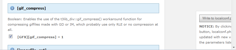
See attached image. This is in the backend view
#4 Updated by Gerrit Code Review about 3 years ago
Patch set 3 for branch master has been pushed to the review server.
It is available at http://review.typo3.org/12660
#5 Updated by Ingo Pfennigstorf about 3 years ago
Checked in Chrome and Firefox. Looks good (Patch Set 3).
Just checked IE 8 and IE 9 - both look good
#6 Updated by Ingo Renner about 3 years ago
Wouldn't it make more sense to put the button under the menu on the left and make the (already existing) groups act like accordions? :)
#7 Updated by Steffen Ritter about 3 years ago
Ingo Renner wrote:
Wouldn't it make more sense to put the button under the menu on the left and make the (already existing) groups act like accordions? :)
I would only show the button when sth. changed...
btw:
you just might hit enter?
#8 Updated by Ingo Pfennigstorf about 3 years ago
Steffen Ritter wrote:
btw:
you just might hit enter?
That's what I wrote above ;) So there is no real need for the button? :)
Accordions are so 2008 imho and slow down editing and finding the desired parameter
#9 Updated by Ingo Pfennigstorf about 3 years ago
- File left.png added
Ingo Renner wrote:
Wouldn't it make more sense to put the button under the menu on the left
don't know. What do you think (see attached screenshot)
#10 Updated by Ingo Pfennigstorf about 3 years ago
- File bothfixed.png added
Or what about both fixed on the left side (bothfixed.png)
#11 Updated by Ingo Renner about 3 years ago
Ingo Pfennigstorf wrote:
Or what about both fixed on the left side (bothfixed.png)
works, too. Just change the label to "Save" to not make the icon wrap into the next line.
#12 Updated by Ingo Renner about 3 years ago
Ingo Pfennigstorf wrote:
Accordions are so 2008 imho and slow down editing and finding the desired parameter
IMO they totally make sense here. I agree with the fundability thing though. Therefore we could simply add a button to expand all at once.
#13 Updated by Gerrit Code Review about 3 years ago
Patch set 4 for branch master has been pushed to the review server.
It is available at http://review.typo3.org/12660
#14 Updated by Jens Hoffmann about 3 years ago
I think a "normal" way should be provided - Enter is no real solution. Imagine a Mobile device.
I think it should be a sticker BTN at the Top - like in all other Areas of TYPO3 - where you "save" something.
Greez Jens
TYPO3 Usability Team Leader
#15 Updated by Ingo Pfennigstorf over 2 years ago
Should we maybe close this issue and create a new one in Usability project? I will than abandon my patch
#16 Updated by Wouter Wolters about 2 years ago
- Status changed from Under Review to Closed
Abandoned, there is a new Install Tool
#18 Updated by Gerrit Code Review almost 2 years ago
- Status changed from New to Under Review
Patch set 1 for branch master has been pushed to the review server.
It is available at https://review.typo3.org/23799
#19 Updated by Gerrit Code Review almost 2 years ago
Patch set 2 for branch master has been pushed to the review server.
It is available at https://review.typo3.org/23799
#20 Updated by Gerrit Code Review almost 2 years ago
Patch set 3 for branch master has been pushed to the review server.
It is available at https://review.typo3.org/23799
#21 Updated by Ernesto Baschny almost 2 years ago
- Assigned To changed from Ingo Pfennigstorf to Ernesto Baschny
- Target version set to 6.2.0
There is some outcome from the UX team: #52087
My suggestion (displayed in the screenshots there) will be shortly ready as a review request here and then you can take a look. :)
#22 Updated by Gerrit Code Review almost 2 years ago
Patch set 1 for branch master has been pushed to the review server.
It is available at https://review.typo3.org/24187
#23 Updated by Gerrit Code Review almost 2 years ago
Patch set 2 for branch master has been pushed to the review server.
It is available at https://review.typo3.org/24187
#24 Updated by Gerrit Code Review almost 2 years ago
Patch set 3 for branch master has been pushed to the review server.
It is available at https://review.typo3.org/24187
#25 Updated by Gerrit Code Review almost 2 years ago
Patch set 4 for branch master has been pushed to the review server.
It is available at https://review.typo3.org/24187
#26 Updated by Gerrit Code Review almost 2 years ago
Patch set 5 for branch master has been pushed to the review server.
It is available at https://review.typo3.org/24187
#27 Updated by Ernesto Baschny almost 2 years ago
- Status changed from Under Review to Resolved
- % Done changed from 0 to 100
Applied in changeset c3b73ce4086e9f8da790fd23a8baaf83b736e655.