Suggestion #38735
Improved style for preview notice
| Status: | Needs Feedback | Start date: | 2012-07-07 | |
|---|---|---|---|---|
| Priority: | Should have | Due date: | ||
| Assigned To: | Lars Zimmermann | % Done: | 0% |
|
| Category: | Design | |||
| Target version: | TYPO3 6.2 LTS | |||
| Tags: |
Description
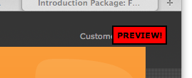
The current notice/hint/warning that you're viewing a preview of a website is quite old.
It'd be cool if we had a newer, more nice hint.
Suggestion in the discussion was to have a bar on top of the page. The bar should be striped like in the backend when in a workspace. However, instead of having yellow stripes for a workspace we could imagine red stripes. The bar should not be hiding the website itself.
A screenshot of the current notice is attached:
Related issues
History
#1 Updated by Jens Hoffmann about 3 years ago
- Category changed from Interface to Design
- Status changed from New to Accepted
Good point.
#2 Updated by Felix Kopp about 3 years ago
Could someone please create a layout?
Color?
Notice text?
Position?
#3 Updated by Felix Kopp almost 3 years ago
This could be done before feature freeze on 14th.
Could anyone create a layout please?
#4 Updated by Felix Kopp almost 3 years ago
Is there any feedback or layout for the preview band?
I would like to offer to realize that.
#5 Updated by Jens Hoffmann almost 3 years ago
- Status changed from Accepted to Needs Feedback
- Assigned To set to Lars Zimmermann
- Priority changed from Should have to Could have
This should be in Lars hands, as he designed the Workspace Modul.
#6 Updated by Felix Kopp about 2 years ago
I would like to implement this during the dev days in few weeks. How can we finalize the concept?
#7 Updated by Ernesto Baschny about 2 years ago
- Priority changed from Could have to Should have
- Target version set to TYPO3 6.2 LTS
Yes, let's have it done. @Lars, it looks easy: do you have a suggestion?