Task #48279
Textbook: Responsive web
| Status: | Closed | Start date: | 2013-05-16 | ||
|---|---|---|---|---|---|
| Priority: | Must have | Due date: | |||
| Assigned To: | Mathias Schreiber | % Done: | 80% |
||
| Category: | Copytext | ||||
| Target version: | 2) Finish Copytext |
Description
Headline and copytext
Headline: Responsive web
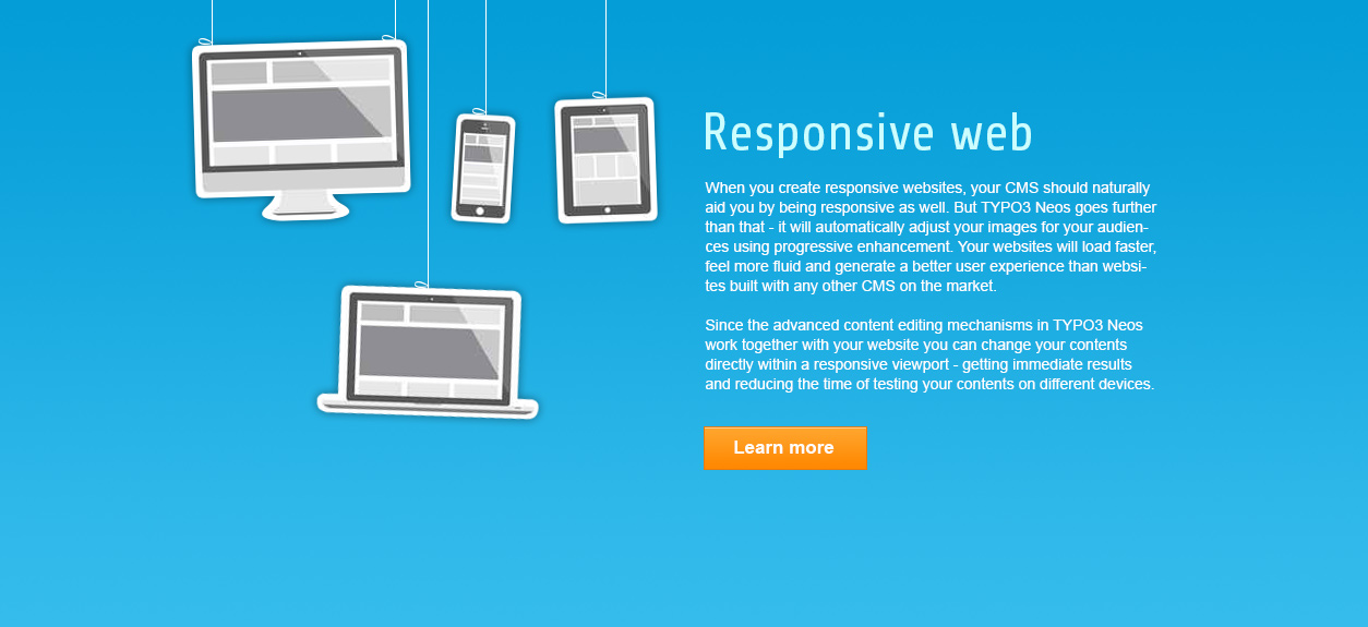
Copy: When you create responsive websites, your CMS should naturally aid you by being responsive as well. But TYPO3 Neos goes further than that - it will automatically adjust your images for your audiences using progressive enhancement. Your websites will load faster, feel more fluid and generate a better user experience than websites built with any other CMS on the market.
Since the advanced content editing mechanisms in TYPO3 Neos work together with your website you can change your contents directly within a responsive viewport - getting immediate results and reducing the time of testing your contents on different devices.
Idea and Reasoning
Since responsive is the new "accessible" and thus the new hot thing on the web, we should make this section a priority.
Focus should be ease of use, reduced testing times etc.
Icon and image style
- Some handheld device
- Animated GIF or HTML5 video showing a finger over some mobile device
History
#1 Updated by Mathias Schreiber about 2 years ago
- Assigned To set to Mathias Schreiber
- % Done changed from 0 to 80
#2 Updated by Mathias Schreiber about 2 years ago
- Status changed from New to Needs Feedback
- Assigned To changed from Mathias Schreiber to Rasmus Skjoldan
#3 Updated by Rasmus Skjoldan about 2 years ago
Suggest cutting it down a bit:
When you create responsive websites, your CMS should naturally aid you by being responsive as well. But TYPO3 Neos goes further than that - it will automatically adjust your images for your audiences using progressive enhancement. Your websites will load faster, feel more fluid and generate a better user experience than websites built with any other CMS on the market.
Since the advanced content editing mechanisms in TYPO3 Neos work together with your website you can change your contents directly within a responsive viewport - getting immediate results and reducing the time of testing your contents on different devices.
#4 Updated by Rasmus Skjoldan about 2 years ago
- Assigned To changed from Rasmus Skjoldan to Mathias Schreiber
#5 Updated by Mathias Schreiber about 2 years ago
Agreed.
By that time I didn't have the "scrolling page" concept in mind.
We could always add a dedicated page for responsive whenever we see fit.
I really like the scrolling idea since it makes it easy to deliver different amounts of content.
#6 Updated by Rasmus Skjoldan about 2 years ago
#8 Updated by Mathias Schreiber about 2 years ago
now this features are pretty neat. Discussing with the tech team right away
#9 Updated by Claas Reimer about 2 years ago
- File 03_Responsive-web.jpg added
Attached a layout for this section, modern and simple illustration of devices. Animation: devices falling from the top of the section. Onepage section Nr.3.
#10 Updated by Rasmus Skjoldan about 2 years ago
All good :-)
#11 Updated by Mathias Schreiber almost 2 years ago
- Category set to Copytext
#12 Updated by Mathias Schreiber almost 2 years ago
- Target version set to 2) Finish Copytext
#13 Updated by Mathias Schreiber over 1 year ago
- Status changed from Needs Feedback to Closed